SSIPP
Website redesign · Case study · Nonprofit
 Jump to final redesign
Project goals 🎯
A friend reached out on behalf of Student-Senior Isolation Prevention Partnership (SSIPP), a national initiative founded in March 2020 by medical students at the University of Toronto. SSIPP operates nine chapters across Canada, fostering comfort in older adults at risk of social isolation over phone calls. Their website was underdeveloped and needed to be more user-friendly. I used this opportunity to focus on aspects critical to good web design, like content auditing, information architecture, analytics, copywriting, and accessibility. I also intend to lay a solid foundation upon which they can update future content.
Tools 🔧
Strikingly, Google Analytics and Tag Manager, Photoshop, Figma
Project duration 📅
Apr.–May, 2021 (4 weeks)
Quick links 🐇
Step 1: Understanding SSIPP's needs Step 2: What works & what doesn't Step 3: The redesign Visual design Final redesign Gauging success Future considerationsStep 1: Understanding SSIPP's needs
I hosted a Zoom call with three members of SSIPP’s exec team to better understand website goals and what they were looking to get out of this redesign. We agreed upon a one-month project deadline.
Website builder
Using a website builder lets SSIPP to continue updating content with ease once I hand it off. They created their original website using Strikingly, to which I suggested switching to Wix, Wordpress, or Squarespace, which offer more features and storage at similar or lower price points. However, SSIPP already renewed their annual subscription few months prior, so switching builders was not an option for this redesign.
Website goals
- Direct healthcare providers and coordinators looking to refer older adults, to their nearest SSIPP chapter
- Motivate healthcare professional students to get involved as volunteers
- Interest site visitors to take action, provide information on social isolation, and highlight SSIPP’s services
Note: Referrals and volunteer sign ups are submitted through emails and Google Forms unique to each SSIPP chapter. Perhaps centralizing this process can be a consideration for the future.
Target site visitors
Website aesthetics
I encouraged the execs to each come up with three words that describe how the website should look, and feelings to evoke in visitors. I used their words as guidance for when I began the redesign:
- Clean (x3)
- Inspiring (x2)
- Simple
- Professional
- Motivating
- Empowering
Comparing other websites
Let’s have a glance at the landing pages of four non-profit organizations and how they engage with visitors. What they have in common:
- A visible, call-to-action (CTA) button on the top right for easy access
- Bold opening statements to give visitors a general idea of what the organization is supporting
- 5 to 6 links on the top nav bar
- High resolution photos for visual impact and emotional appeal
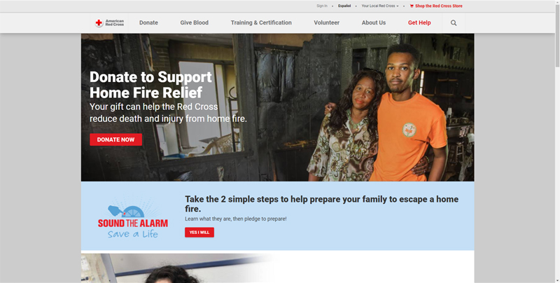
American Red Cross
- Use of red brand colour to accent elements like CTAs
- Having a CTA on the splash photo (Donate Now) that is different from CTA on main nav bar (Get Help), allowing them to promote different actions that may be equally important
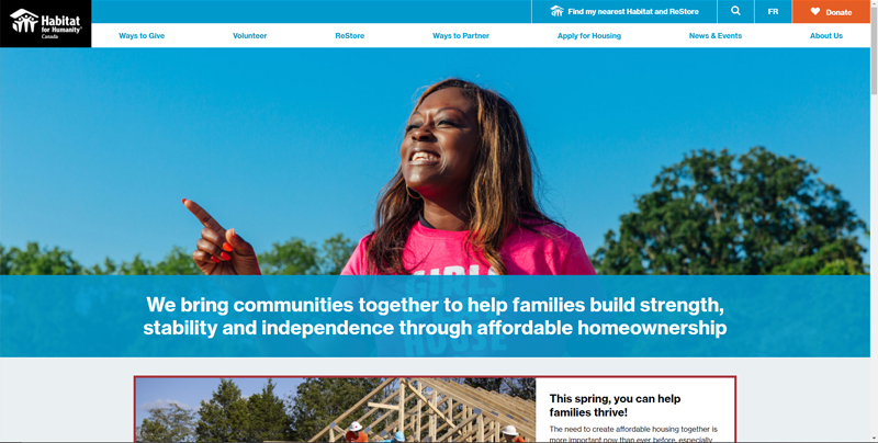
Habitat for Humanity
- Choice of photo with the sky, further driving their brand colour (blue)
- Orange CTA button is complementary to blue
- Dedicating a secondary nav bar to highlight CTA and search functions, separate from the main nav bar
Thorn
- Monochromatic splash photo, text, and CTAs emphasize their orange brand colour
- A lightly faded splash photo with a smiling girl negates, in a positive manner, the heavy issue Thorn is targeting
- Elements are spaced out, giving the website a fresher feel relative to most NPO websites
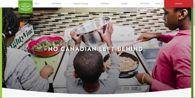
Second Harvest
- Photo features a green cutting board, broccoli, and a red sweatshirt, which are synonymous with brand colours
- Clean splash photo with a bold statement
Step 2: What works & what doesn't
Analytics and SEO
SSIPP had not linked Google Analytics to their website, but Strikingly luckily had a few basic metrics seen in the figure below. The values shown are reflective of unique visitors in the last 90 days.
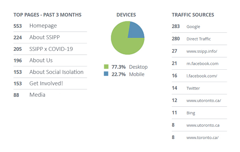
There is a noticeable drop in visitors between the homepage (553) and Get Involved! (153) with a conversion rate of 28% - a key area for improvement. The website is accessed mostly through desktop (77%), over mobile (23%), which helps prioritize layout design towards the former. Google is a major traffic route, but I noticed SSIPP left pages’ title tags and meta descriptions blank, which could significantly hinder site visibility on search engines. After redesigning the site, I made sure to fill in those fields, as well as adding alt text to images.
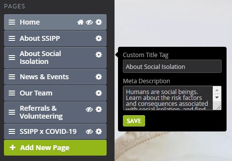
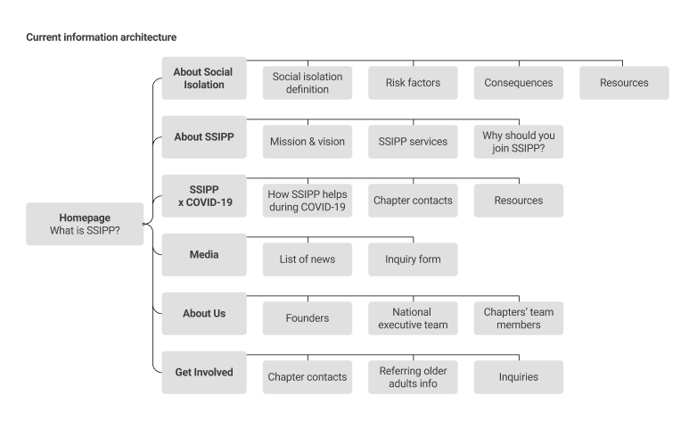
Info architecture and page-by-page audit
I mapped out the current info architecture (IA) and captured page screenshots. I noted what already works, suggested areas for improvement, and generated a revised IA.
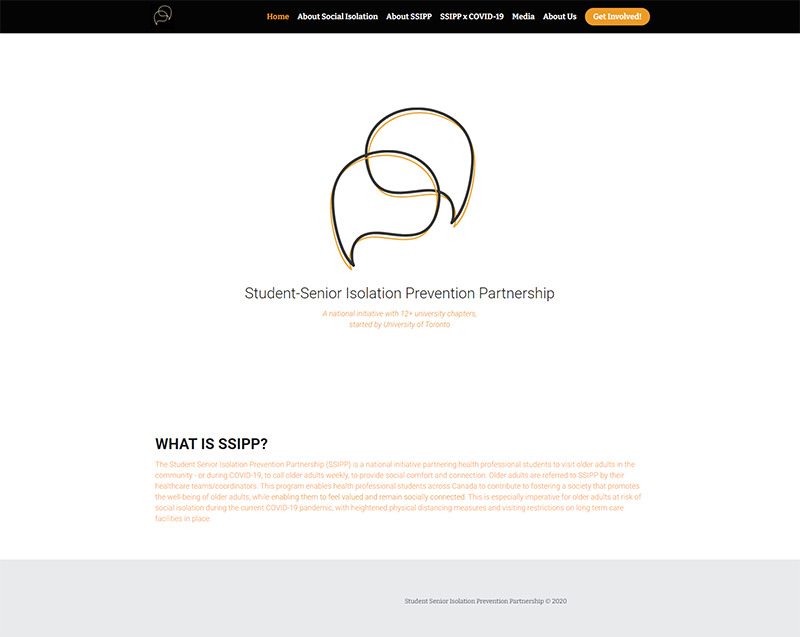
Homepage
What works
- High-contrast navigation bar
- CTA button draws attention
- Organization name is present
To improve
- At first glance and without scrolling down, the visitors are unable to gather much on what SSIPP is about
- Rename Get Involved! CTA button to organization-specific actions, like Refer an Older Adult and Join a Chapter, making it easier for visitors to quickly find relevant info
- About SSIPP and About Us buttons are indistinguishable in meaning; consider renaming the latter to Our Team
- Low contrast between thin, small orange text on white background

About Social Isolation
What works
- Bolded statement creates a strong presence
- Large background photo for emotional impact
To improve
- Low contrast between paragraph text colour and background image
- Space can be better utilized to present additional info
- Risk factors and consequences could be better read as a list

About SSIPP
What works
- Mission and vision statements are present
- Good choice of background photo for emotional impact
To improve
- Low contrast between text and background image
- A short description detailing each service would benefit visitors
- Low contrast between orange text and icons, against the grey background
- Why should I get involved? section would be more relevant under the Get Involved! page and would benefit from a higher placement on the page
- Swiping to read each point is time consuming; should rather present all points in one shot
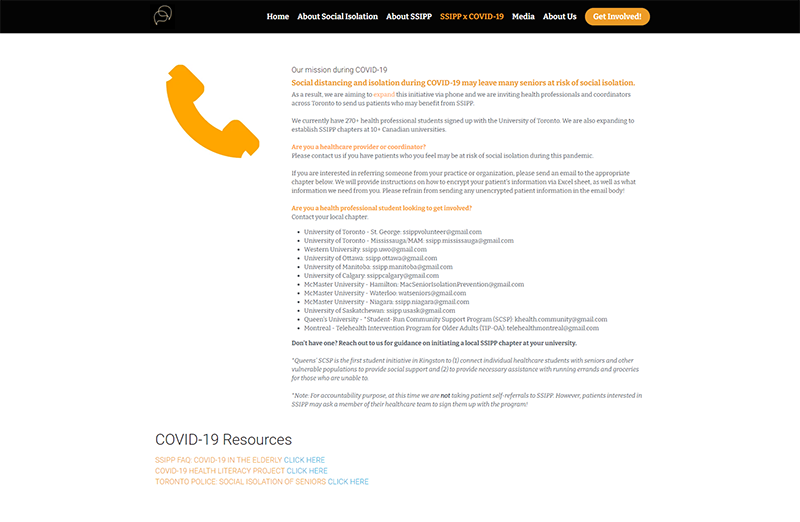
SSIPP x COVID-19
To improve
- Page lacks visual hierarchy and is text-heavy
- Page lists chapters’ contact info, which is redundant as it is already listed under the Get Involved! page
- Resource listings are redundant and should be combined with the ones under About Social Isolation page
- Are the emails up to date?
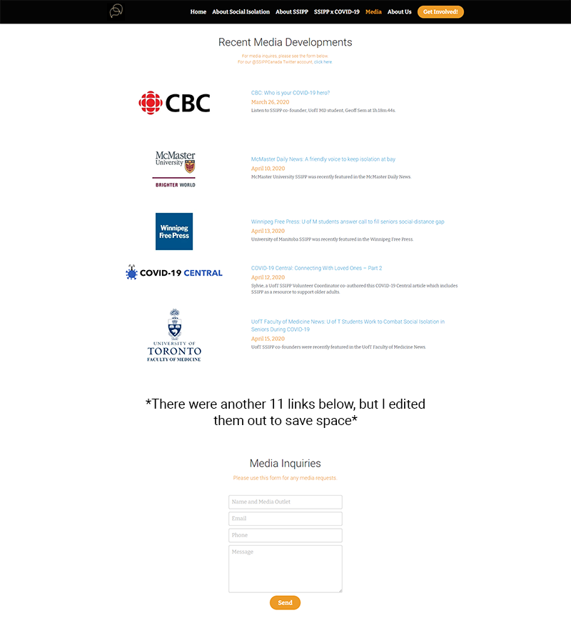
Media
To improve
- News should be listed from the newest first
- Twitter link on top of page can be missed easily
- Some links are repeats
- Media inquiry fields at the bottom of the page could be easily missed
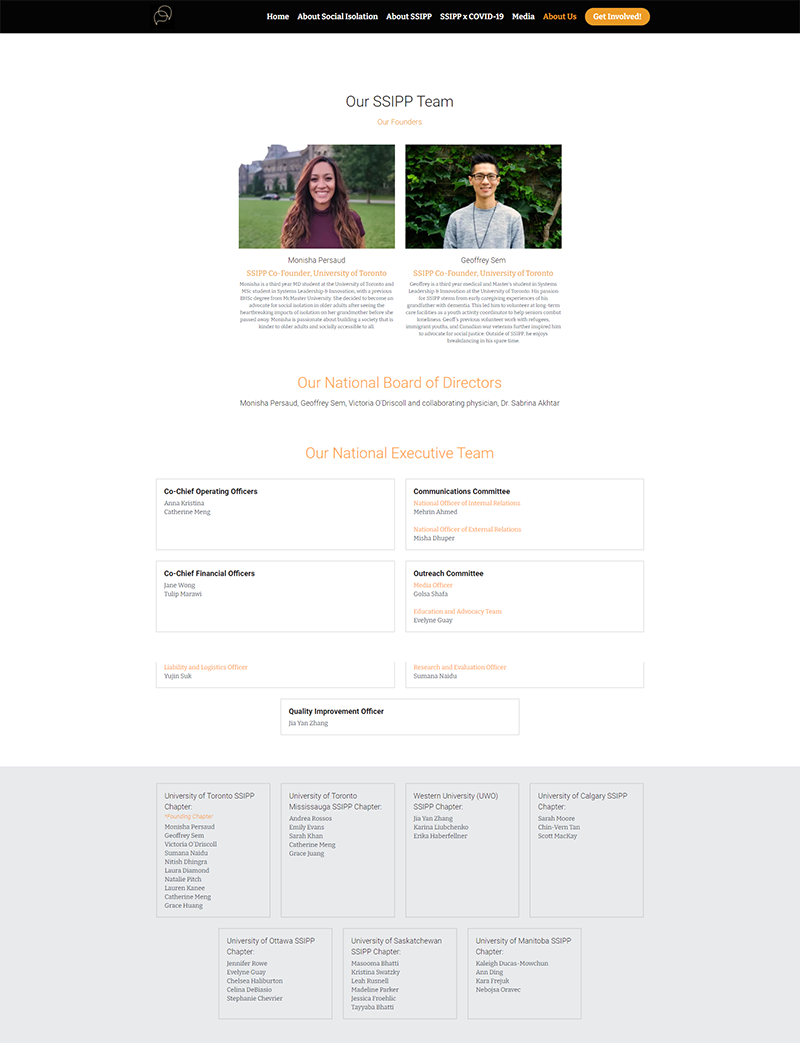
About Us
What works
- Good use of photos, although adding faces for those on the executive team would enhance trust and make the site more personable for visitors
To improve
- Space taken up by team listings could be condensed
- Are the team members list up to date?

Get Involved
What works
- Chapters’ contact info is clear
To improve
- The main purpose of the website is to direct referrals of older adults to the nearest SSIPP chapter, so details pertaining to that goal should come first before volunteering info
- Are the links and emails up to date?
General comments
- Does SSIPP engage with social media? No links are seen.
- Make font sizes, styles, and colours consistent across the website
- Ensure high contrast between text and background images for easier reading
Step 3: The redesign
Revised info architecture
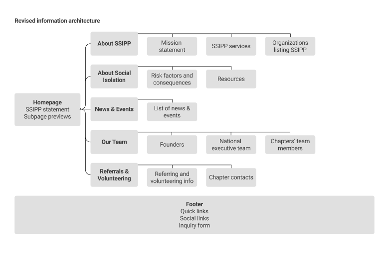
I condensed and streamlined the website’s IA by changing the following:
- Homepage features previews of subpages, enticing visitors to learn more
- Removed Home link to save space; logo on the top nav bar acts as link to homepage
- Renamed Media to News & Events to drive page visits by visitors not associated with the media per se, as well as featuring upcoming or recent events
- Renamed About Us to Our Team, which distinguishes it from About SSIPP
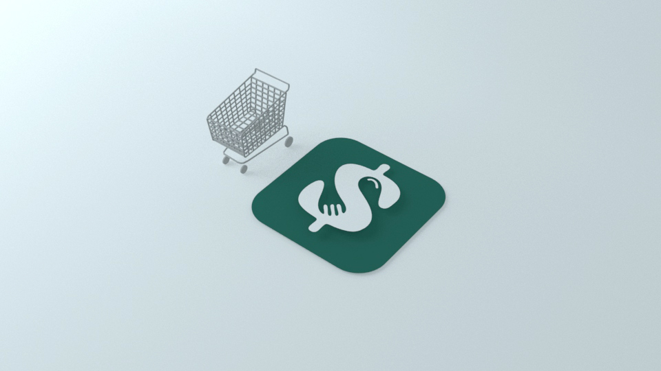
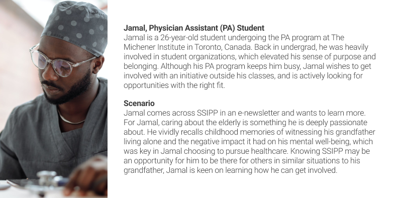
- Although referrals and volunteer forms are separate goals, they are both chapter-specific, so it made sense to combine them into a single page, Referrals & Volunteering (formerly Get Involved!). This is easier for site visitors like Ayesha and Jamal to find the info they are looking for.
- Relocated inquiries form to the footer so visitors will have access to it at all times
Lo-fi wireframes
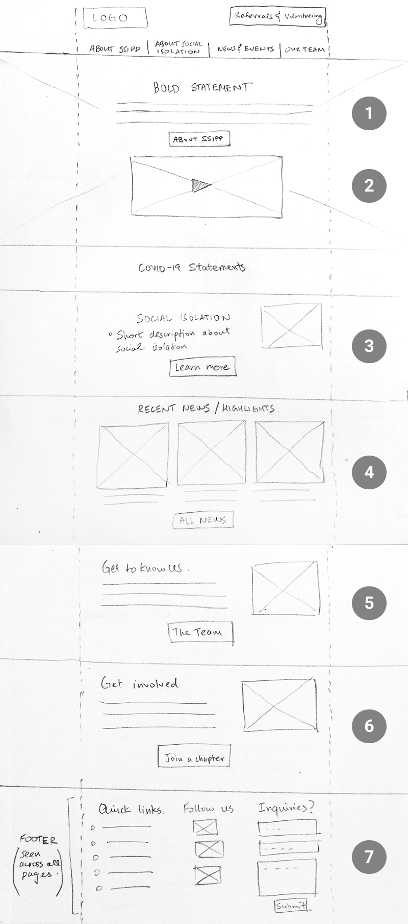
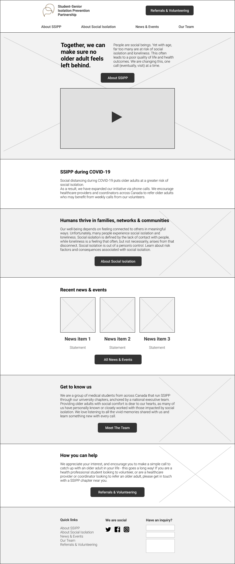
Homepage
- Bold statement accompanied by a short description lets visitors to quickly identify the issue SSIPP is targeting
- Featuring a video SSIPP execs wanted to include on website landing
- A relatable set of statements regarding social isolation, enticing visitors to learn more about the issue; also acts as a second chance to direct visitors to the About Social Isolation subpage
- Highlighting news and events to get visitors caught up with what SSIPP has done lately
- A personable introduction of the SSIPP team to promote trust in the visitors
- Now that visitors are more familiar with SSIPP, the website can encourage them to take action
- Visitors also have the option to navigate to subpages from the footer, follow social media, and submit inquiries or feedback; appears across all subpages
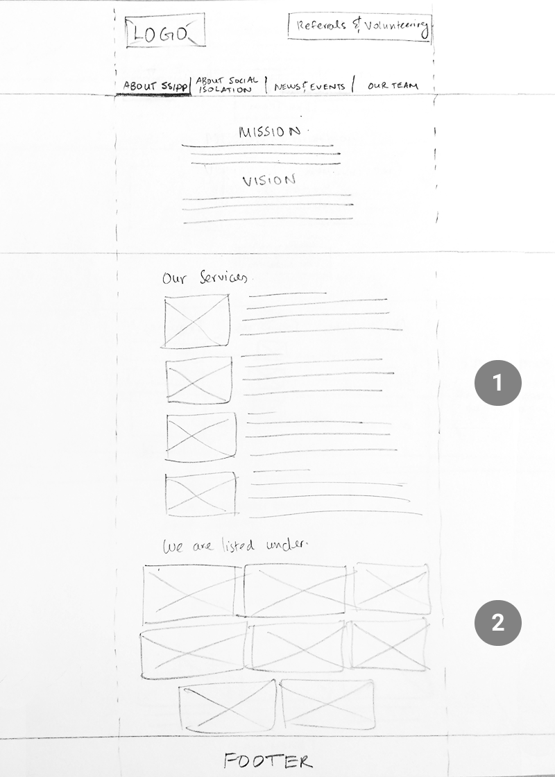
About SSIPP
- Service descriptions provide visitors with more details on how SSIPP helps fight social isolation
- Execs asked to include a list of organizations that have listed SSIPP as a community resource
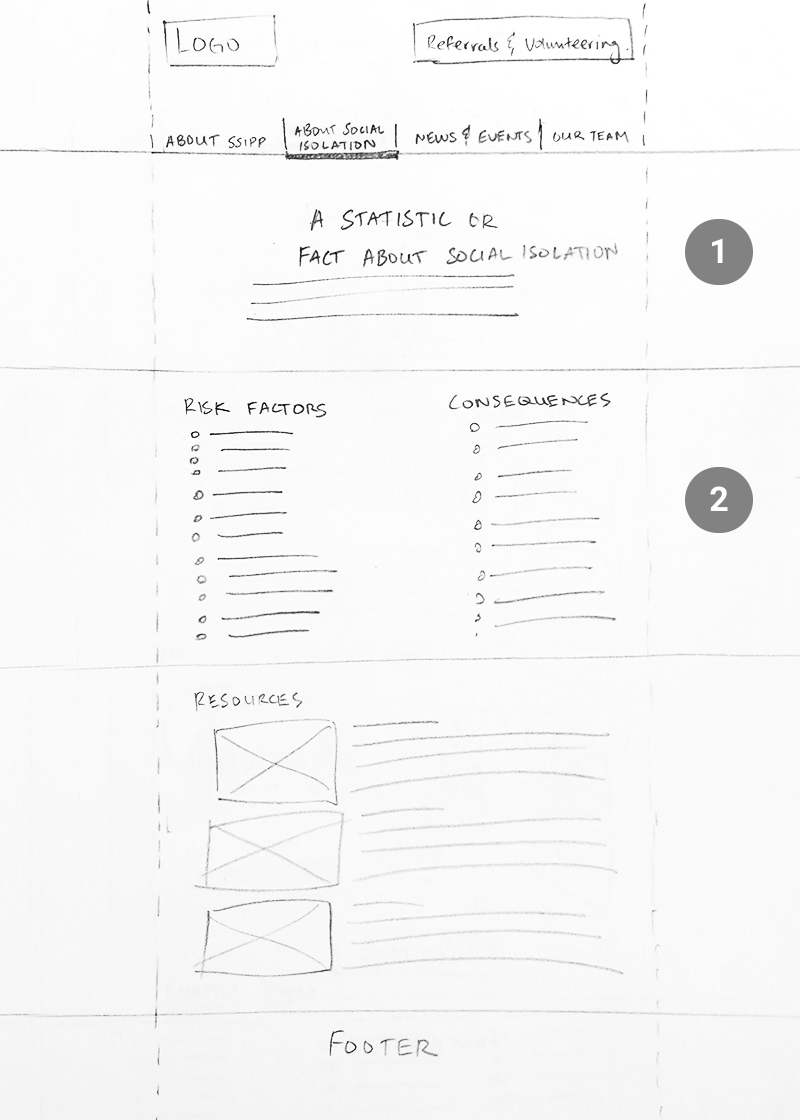
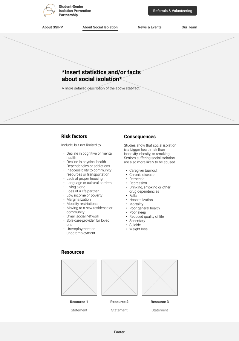
About Social Isolation
- A significant statistic or fact to illustrate the seriousness of social isolation
- Risk factors and consequences are presented in a list form for better readability
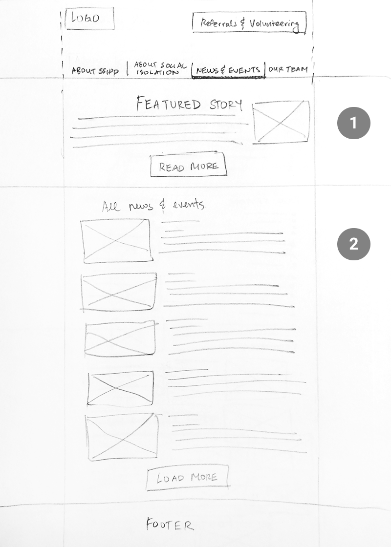
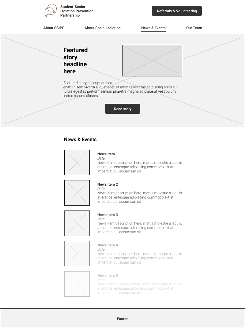
News & Events
- SSIPP can use this space to highlight an upcoming event or recent news story/event
- List of news and events sorted by most recent. I was hoping Strikingly would offer a ‘load more’ feature to save page length, but it was not the case.
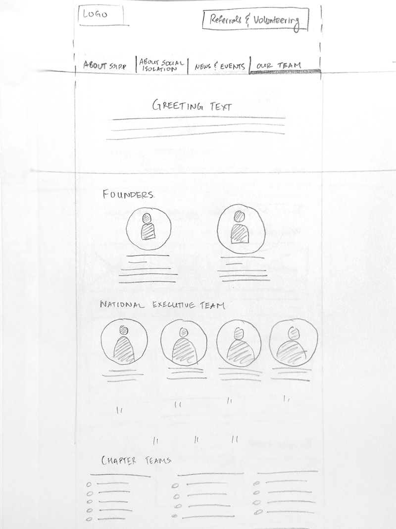
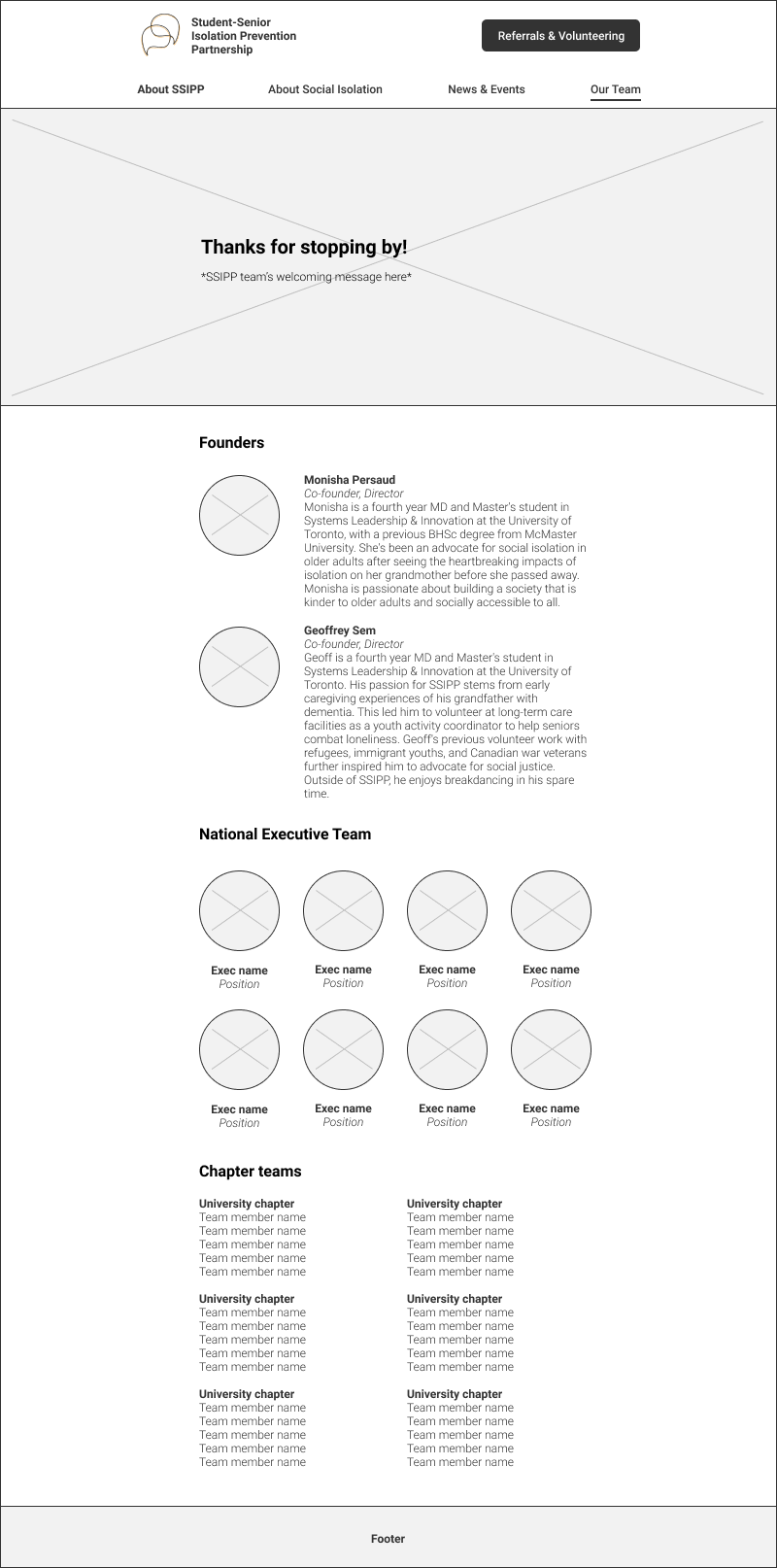
Our team
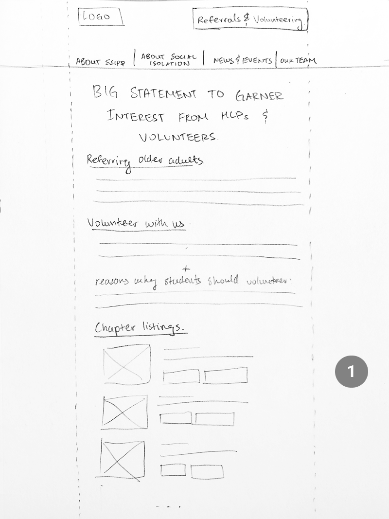
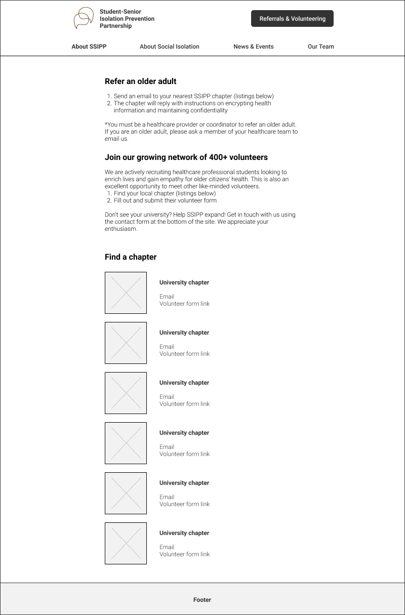
Referrals & Volunteering
- University chapter listings with respective emails for referrals and links to volunteer sign-up forms
Mid-fi wireframes
I used Figma to block out higher fidelity wireframes of the envisioned website layout. I also focused on copywriting for which I worked closely with an exec to ensure the tone and message aligned with how SSIPP wishes to be perceived by site visitors.
Homepage

About SSIPP
About Social Isolation
News & Events
Our Team
Referrals & Volunteering
Visual design
Colours & branding
I kept the website consistent with the organization’s colours, orange and dark grey. I used orange to accent photos, buttons, and captions, while assigning dark grey to header and paragraph text.
Graphical elements
I enhanced the emotional appeal of the website using photos obtained and modified through Pexels and Unsplash. Despite the seriousness of social isolation, I chose to evoke hope in visitors by tinting the photos with a soft orange tone. These photos also work to balance out certain text heavy sections on the website.
Typeface
I initially planned to pair serif and sans-serif typefaces for headers and paragraph text, respectively. However, Strikingly did not allow for this as I explain further under future considerations. I settled on Roboto as it works decently as a header, and even more so as a legible paragraph font.
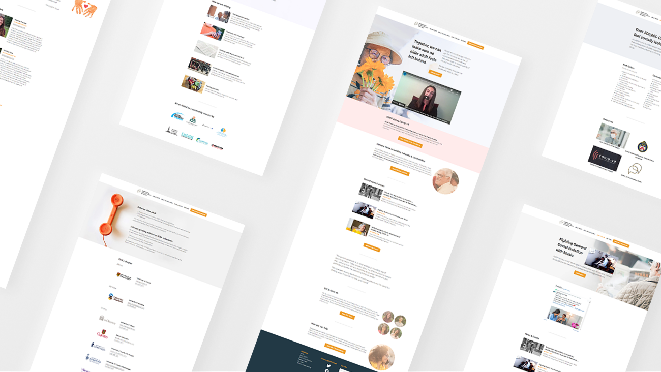
Final redesign
View the redesigned website at ssipp.info. Certain elements may have changed since, so below are screenshots of the redesign at the time of completion. Note, footers on subpages were cropped to save space.
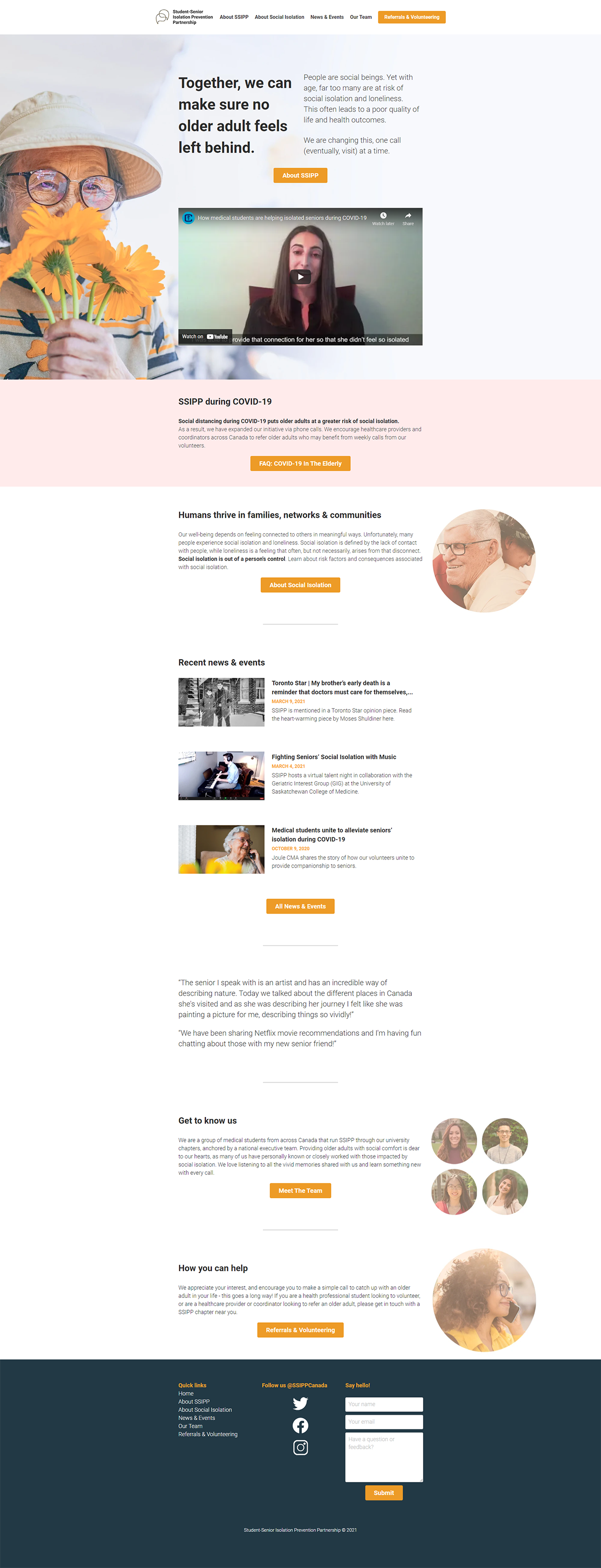
Homepage
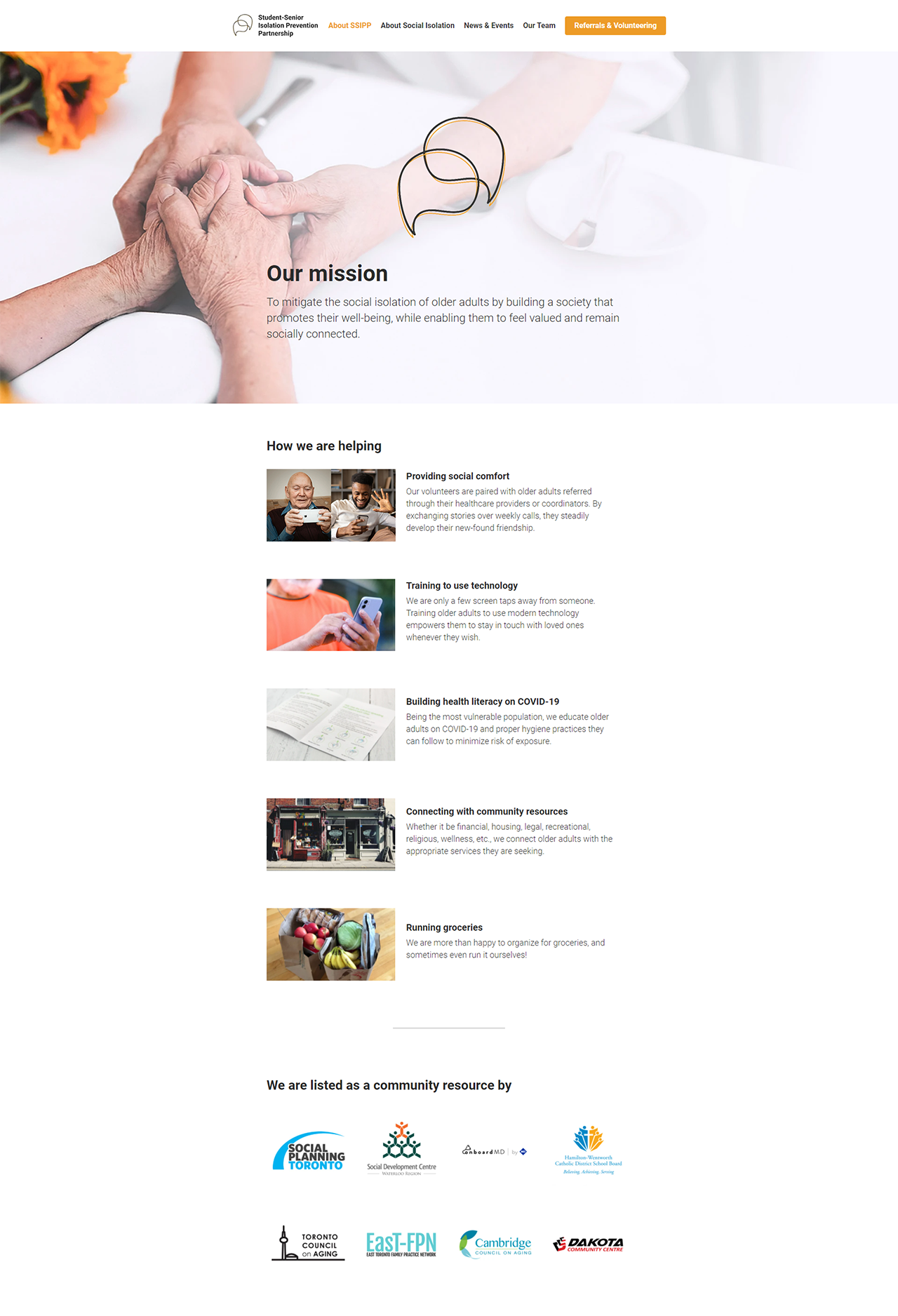
About SSIPP
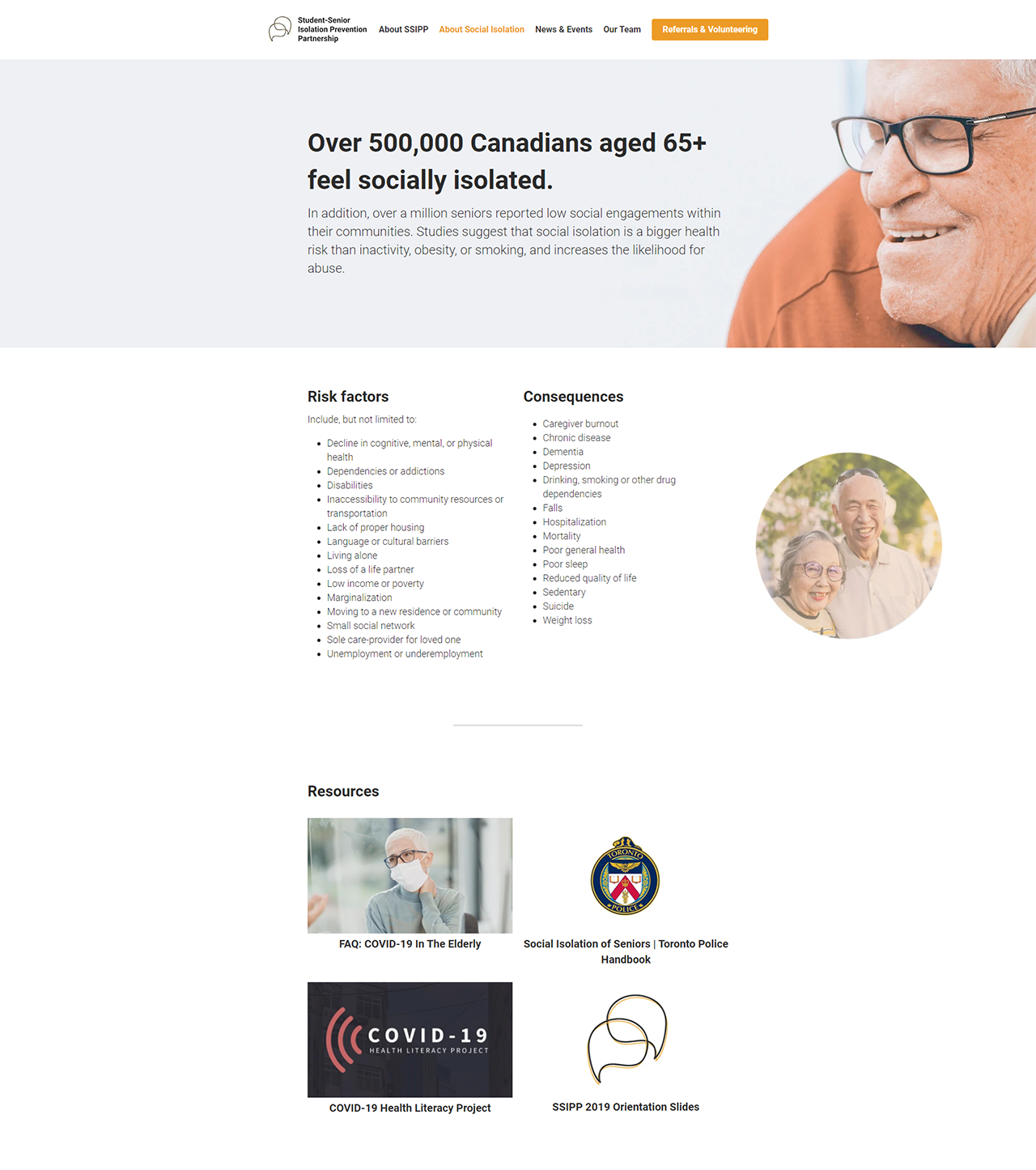
About Social Isolation
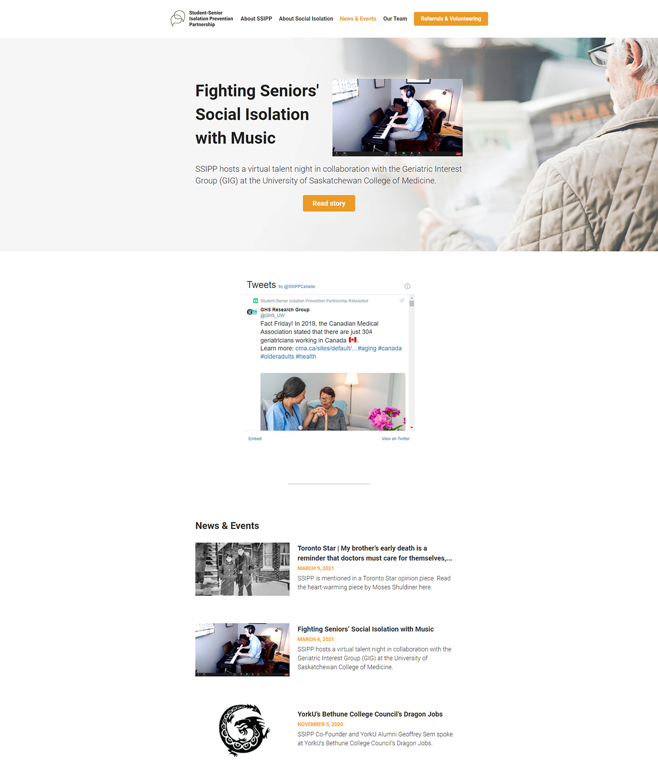
News & Events
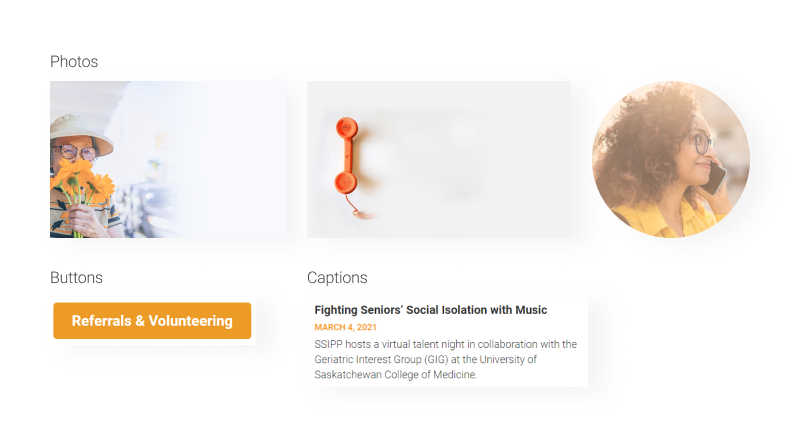
*19 news items were cropped from this screenshot to save space.
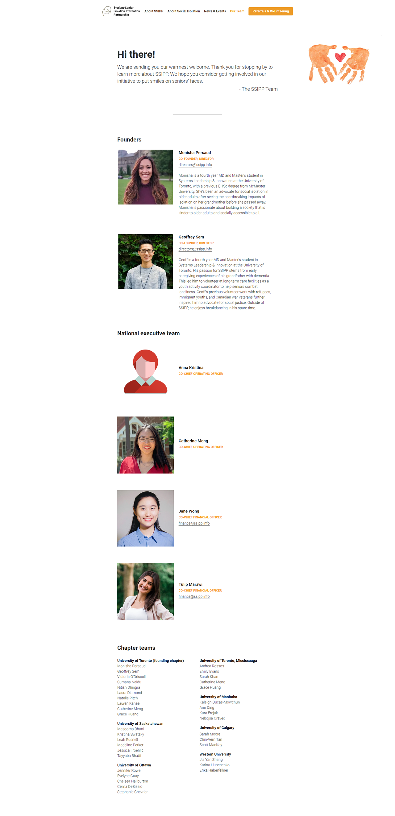
Our Team
*7 national exec members were cropped to save space. I used placeholder graphics for missing headshots and left space for blurbs, which SSIPP will add at a later date.
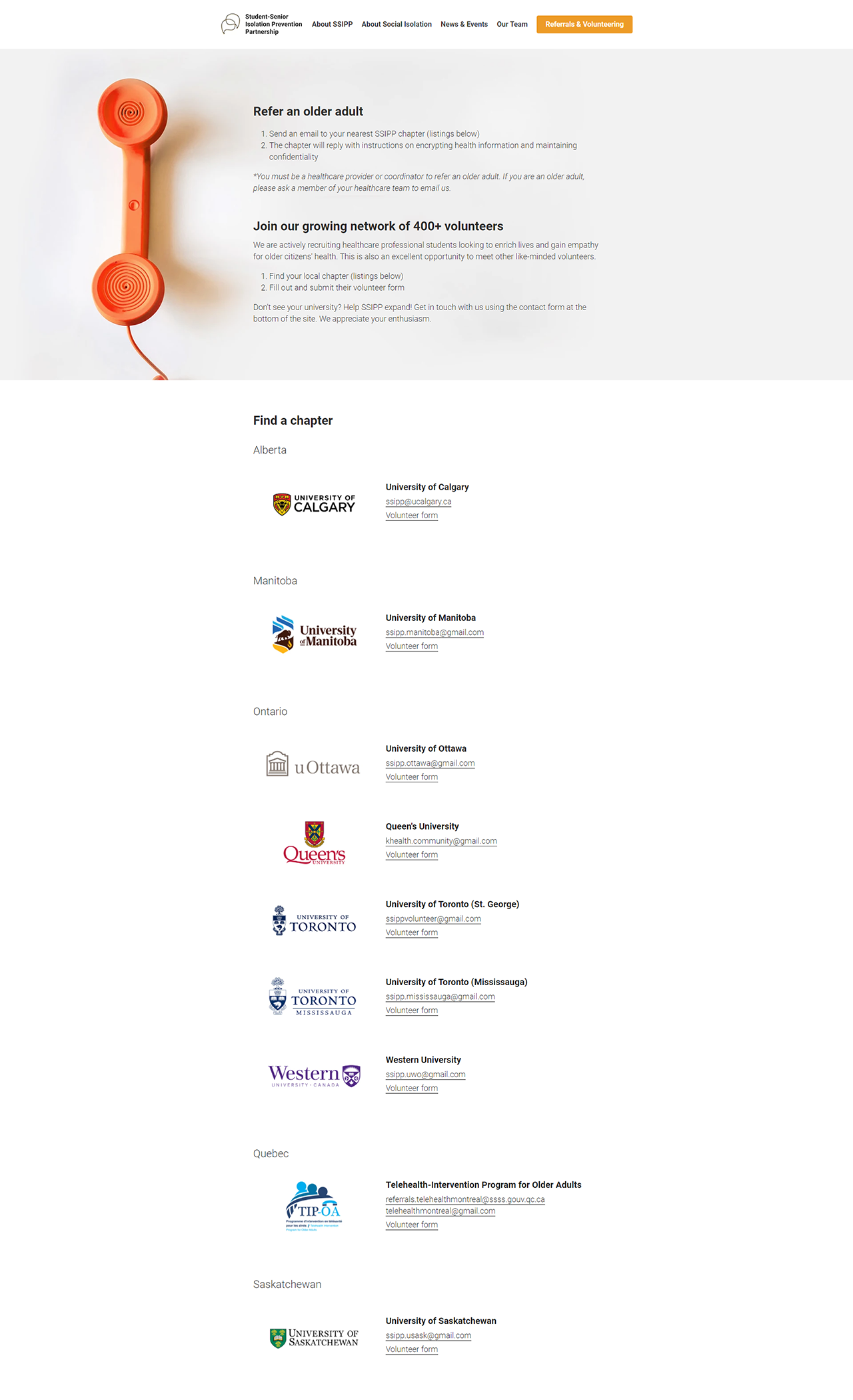
Referrals & Volunteering
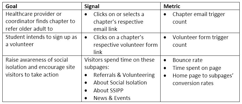
Gauging success
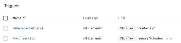
I linked the website with a Google Analytics UA (Universal Analytics) code, which tracks essential metrics such as page view counts, bounce rates, average time spent on a page, etc. I also created triggers using Google Tag Manager to track site visitors interacting with email and volunteer form links on the Referrals & Volunteering page, which are critical to SSIPP’s success. I intend to report back on site performance after a month or two have passed, stay tuned.
Future considerations
Centralize volunteer forms
SSIPP is a fast-growing organization that will continue to serve older adults at risk of social isolation well beyond this pandemic. To this end, having a centralized volunteer form, either on a third-party host or on the website itself, may prove beneficial. This would also make it easier to analyze volunteer data across the entire organization, as it would no longer be siloed between chapters.
Switch website builders
Strikingly is decent, but does not offer the flexibility, competitive pricing, and user-friendliness of Wix, Squarespace, or Wordpress. It challenged me to generate work-arounds as some of my earlier design decisions were impacted by Strikingly’s drawbacks. I suggest SSIPP considers switching builders down the line, and submitted feedback to Strikingly (effective May, 2021) in hopes they improve their product for future users.
Feedback to Strikingly